Case Study 01 Mobile · Fashion E-commerce 2024

GoodFit

A smarter way to try fashion. It doesn't start on a shopping app — it starts on Instagram.

Role Lead UX/UI Designer
Focus Research → System → Ship
Year 2024
Platform iOS · Android
Output Full app · 12+ screens
Section 01 — Intro

It starts on Instagram.

A user is scrolling through reels and suddenly pauses on a video — a small brand showcasing a dress, a thrift store styling a unique outfit, or a creator promoting something that feels different from mainstream fashion. The interest is instant. They save the post, maybe even check the profile, and for a moment, they genuinely want to buy it.

But that intent quickly runs into friction. There's no proper website, just a WhatsApp number or a "DM to order." Sizes are unclear, pricing feels inconsistent, and delivery timelines are uncertain. The excitement fades into hesitation. Most of the time, the purchase never happens.

Section 02 — Problem

Understanding the problem.

This isn't a discovery problem. It's a what-happens-next problem.

Users are already discovering products they love every day. The real issue lies in what happens after that. Instagram has become a powerful space for fashion discovery, especially for homegrown brands, but it was never designed for structured commerce.

Brands are forced to manage orders manually, while users are left navigating an unreliable and fragmented buying experience. There is a clear gap between seeing something you like and actually owning it.

Section 03 — Reframe

The shift in thinking.

Instead of asking, "How can we improve online shopping?", the focus shifted to a more relevant question: How can we make Instagram-driven fashion easier to experience in real life?

Users don't need more options. They need more confidence. Brands don't need more visibility. They need a better system. This led to a simple idea — bring structure to discovery and remove the risk from decision-making.

Bring structure to discovery. Remove the risk from decision-making.
Section 04 — The product

Introducing GoodFit.

GoodFit is designed as a bridge between inspiration and action. It creates a space where homegrown and Instagram-first brands can showcase their products beyond posts and DMs, while giving users a smoother and more reliable way to explore and purchase them.

The experience feels familiar — like scrolling through social media — but with the added clarity of a structured platform. What makes it different is the shift in commitment. Instead of asking users to buy immediately, GoodFit allows them to try products at home before making a decision. With quick delivery, users can move from discovery to real-world experience within hours, not days.

Section 05 — Research

Research & discovery.

To understand this behavior, I focused on how users interact with fashion content and how they move from discovery to purchase. I spoke with users who frequently explore fashion on Instagram and shop online to understand their real experiences.

During these conversations, I noticed a consistent pattern. Users actively discover and engage with fashion content — often saving posts or revisiting them later. However, when it comes to purchasing, their behavior changes. They slow down, overthink, or drop off entirely.

Many users shared that past experiences influenced this hesitation. Instances where products didn't match expectations, issues with fit, or uncertainty around quality made them more cautious in future decisions. As a result, even when users find something they like, they don't always feel ready to act on it.

// Synthesizing user research
Discovery patterns
Users discover outfits mainly through Instagram reels
Save posts instead of taking immediate action
Prefer curated, niche feeds over mass marketplaces
Trust issues
Not sure how the outfit will look in real life
Doubt about product quality from photos alone
Fear real product feels different than the image
Images can feel misleading or filtered
Validation needs
Want to try before committing to buy
Overthinking before placing an order
Fear of regret after the purchase arrives
Friction points
Buying through DMs feels unstructured
No clear sizing or fit guidance
Too many steps to complete an order
Decision points
Confusion in pricing, order & refund flow
Concerns about return and refund timelines
Too many steps to complete the order
Decision behavior
Want to physically try before buying
Trust comes only after trying
Mirror check is the final decision moment
Section 06 — Ideation

From information to experience.

After understanding user behavior, it became clear that the issue wasn't discovery, but trust. Users were finding products they liked, but hesitated when it came to making a decision.

Initially, I explored improved product details, images, and reviews. While these added clarity, they still depended on users trusting what they saw on a screen, which wasn't enough. The hesitation came from experience, not lack of information.

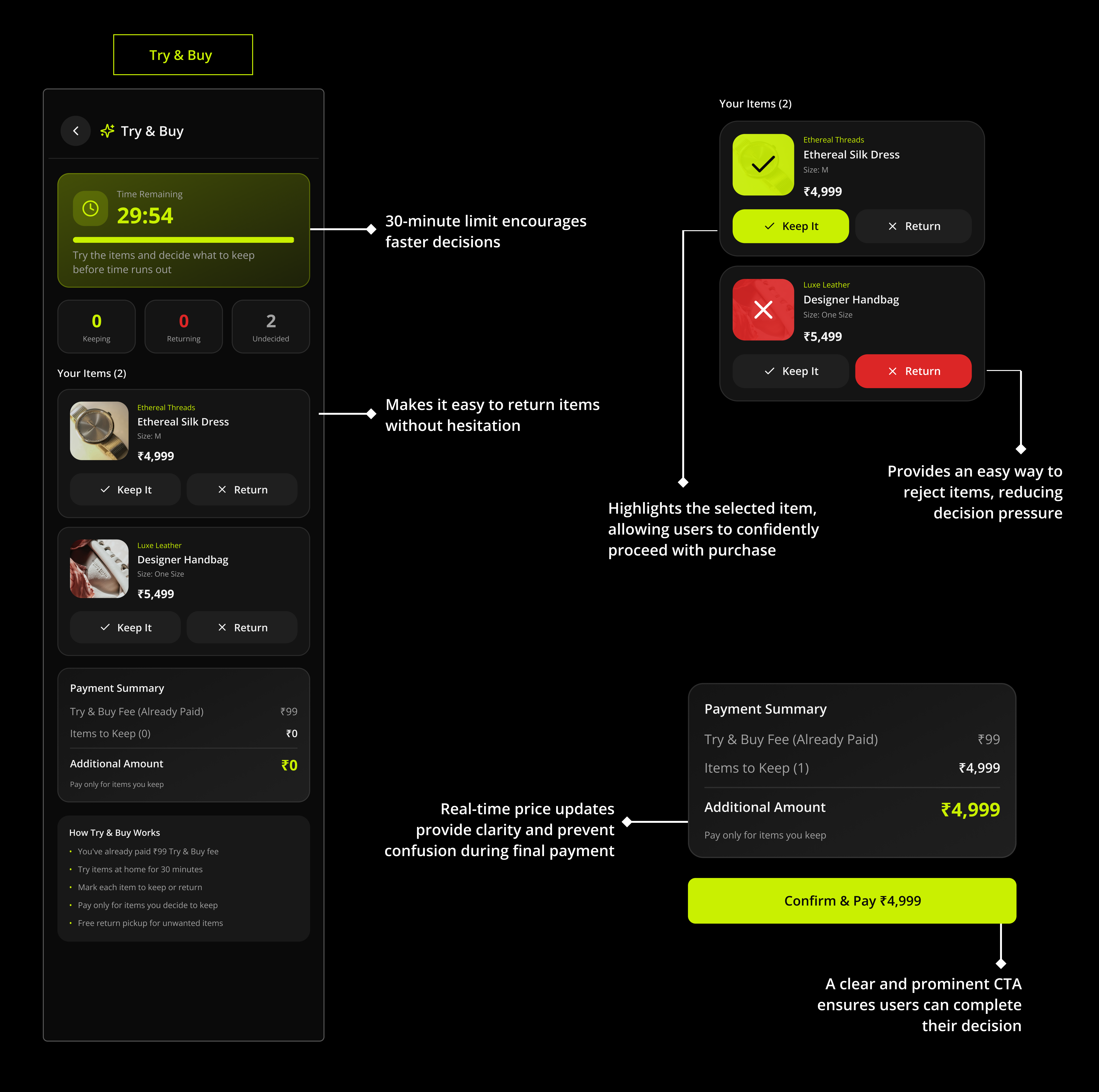
This shifted the thinking toward how users actually make decisions in real life. Confidence comes when they try the product themselves, when they see how it fits and feels. That became the core direction — instead of improving online shopping, the focus moved to enabling users to experience the product before committing to it.

Ideation — Decision Confidence Mind Map /ideation/v1.0
Ideation mind map showing decision confidence framework
Section 07 — User flow

The core journey.

To translate the idea into a real experience, the focus was on creating a simple and frictionless journey that helps users move from discovery to decision with confidence.

User Flow — Core Journey (Onboarding, Discovery, Checkout & Trial) /user-flow/v1.0
GoodFit user flow diagram showing onboarding, discovery & shopping, and checkout & trial flow
Section 08 — Wireframes

Low-fidelity wireframes.

After defining the user flow, I translated the journey into low-fidelity wireframes to focus on layout, structure, and usability without visual distractions. The goal was to ensure that users can quickly navigate, explore products, and make decisions with minimal friction.

Wireframes — 12 screens, splash to my-orders /wireframes/v1.0
Low-fidelity wireframes for GoodFit covering all 12 screens
Section 09 — Hi-fi UI

Refining the experience.

After defining the structure through wireframes, the focus shifted to creating a visually clear and intuitive interface that helps users make quick decisions while browsing products. The design prioritizes key elements like product visuals and primary actions, while keeping the layout clean and distraction-free.

A dark theme was used to create a more immersive experience, with careful use of contrast and spacing to maintain readability. Key screens such as home, product details, and checkout were designed to guide users smoothly from discovery to decision, while the Try & Buy feature was highlighted to reduce hesitation and build confidence.

Overall, the transition from wireframes to UI focused on improving clarity, strengthening visual hierarchy, and making every interaction feel simple and predictable.

High-fidelity UI — full app visual system /screens/v1.0
High-fidelity UI screens for GoodFit
Try & Buy — annotated breakdown /feature/try-and-buy
Try and Buy feature annotated breakdown showing 30-minute timer, keep/return controls, and payment summary
Section 10 — Impact

Expected impact.

The GoodFit experience is designed to improve confidence in fashion purchases by reducing hesitation at the most fragile moment — the point of decision. Most drop-offs in social commerce don't happen because users lose interest; they happen because users lose certainty.

By introducing a Try & Buy model, the product gives users a way to experience a piece in their own space before committing to it, while giving Instagram-first brands a structured channel that quietly builds trust over time. The outcome is a flow where users feel safer to act, and small brands feel more credible to buy from — both of which compound into stronger conversions.

01 Reduced hesitation
02 Faster decisions
03 Improved trust
04 Better shopping confidence
01 / Impact

Reduced purchase hesitation.

By allowing users to try products before fully committing, the experience reduces anxiety around fit, quality, and overall satisfaction — the three concerns that surfaced most often in research conversations.

02 / Impact

Increased trust for small brands.

Structured product discovery, transparent checkout, and trial-based shopping help smaller Instagram-first brands feel more reliable and credible — closing the gap between an unfamiliar profile and a confident purchase.

03 / Impact

Higher conversion potential.

Users who experience products in real life are more likely to complete purchases confidently compared to traditional social commerce flows where buying intent often fades inside a DM thread.

04 / Impact

More confident decision-making.

The overall journey focuses on helping users move from inspiration to action with less uncertainty and fewer emotional barriers — turning hesitation into a quiet, deliberate "yes."

Section 10 — Reflections

Reflections & learnings.

Working on this project pushed me to think beyond screens and focus on real user behavior and decision-making. It helped me understand how thoughtful design can reduce hesitation and build confidence.

From initial ideas to final execution, the process was a continuous journey of learning, iterating, and improving — both the product and my perspective as a designer.

01 / Lesson

Trust is designed, not declared.

No amount of better photography or copy could replace the confidence of holding the piece in your hand. Designing the Try & Buy moment — not the product page — was where the trust got built.

02 / Lesson

The in-between screens carry the weight.

"Order scheduled," "Trial in progress," "Items returned." The hardest screens weren't checkout — they were the small confirmations that quietly tell the user the system is on their side.

03 / Lesson

Constraints sharpened the system.

Bounding the trial to a small bundle and a 30-minute window wasn't just logistics — it forced cleaner IA. Cart, schedule, and trial all stayed below cognitive overload because the model was bounded from day one.

04 / Lesson

Design grew alongside the designer.

Every iteration reshaped both the product and how I think — about hesitation, about confidence, about how much of design is really about removing the parts that quietly punish people for being curious.

Next case study →
Case 02 / 02
SaaS · Recruitment